

Here is a question worth sitting with for a moment.
Right now, across your school, subject leaders are evaluating their subjects. They are making honest, professional judgements about curriculum quality, pupil achievement, attendance and behaviour, inclusion. They are gathering evidence. They are thinking hard about what is working and what is getting in the way. They are planning what to do next.
All of that insight exists. It is real, it is grounded, and it is happening whether or not anyone else ever sees it.
The question is: are you seeing it?
The problem with how most schools gather insight
Many headteachers and senior leaders rely on a combination of line management conversations, monitoring visits, data reviews, and occasional written updates to build their picture of what is happening across the school. Each of these has value. But together, they tend to produce something fragmented — a patchwork of impressions rather than a coherent, whole-school view.
The problem is not a lack of information. The problem is that the information is scattered. It lives in people's heads, in separate documents, in conversations that happened weeks ago. There is no single place where a headteacher can look and see, clearly and honestly, how every subject and provision in the school is doing — right now.
So leaders end up chasing updates. Or making do with summaries. Or relying on their instinct that things are broadly fine, when the detailed picture might tell a more nuanced story.
What a whole-school dashboard actually looks like
The screenshot below shows something that changes this entirely.
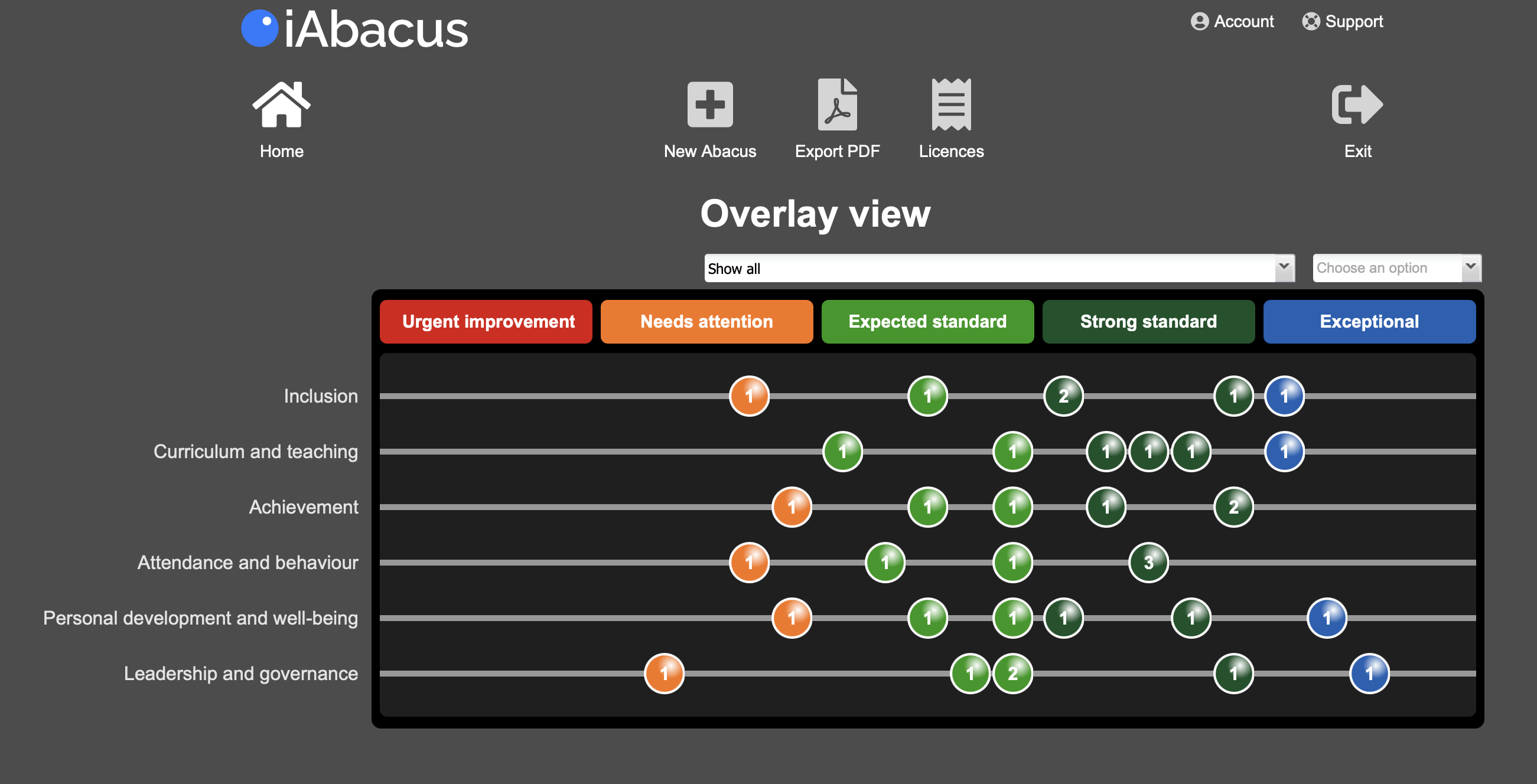
This is an iAbacus Dashboard — a whole-school view combining the subject evaluations of multiple leaders into a single screen. Each row represents a key area: Inclusion, Curriculum and Teaching, Achievement, Attendance and Behaviour, Personal Development and Wellbeing, Leadership and Governance. Each bead represents an evaluation from a subject or area leader, positioned across a scale from Urgent Improvement through to Exceptional.
At a glance, a headteacher can see the spread of judgements across the school. Where are evaluations clustering? Where is there consistency? Where is there a spread of opinion that warrants a conversation? Which areas have leaders placing themselves at Needs Attention, and which have multiple leaders rating their provision as Strong or Exceptional?
The number on each bead shows how many leaders have placed their evaluation at that point. A bead showing "3" in the Strong standard column for Curriculum and Teaching tells you something immediately useful — and clicking into it reveals the evidence, analysis, and action plans that sit behind those three judgements.
This is not a summary. It is not a report that someone prepared for you. It is a live, evidence-rich, panoramic view of your school — built from the genuine evaluations of the people who know their areas best.
Where the dashboard comes from
Here is the thing that makes this so powerful — and so different from conventional reporting tools.
Nobody created this dashboard for the headteacher. Nobody filled in a form, submitted a return, or wrote an update for someone else's benefit. The dashboard is simply what happens when individual subject evaluations, each completed for the subject leader's own benefit, are combined.
Look at the second screenshot.
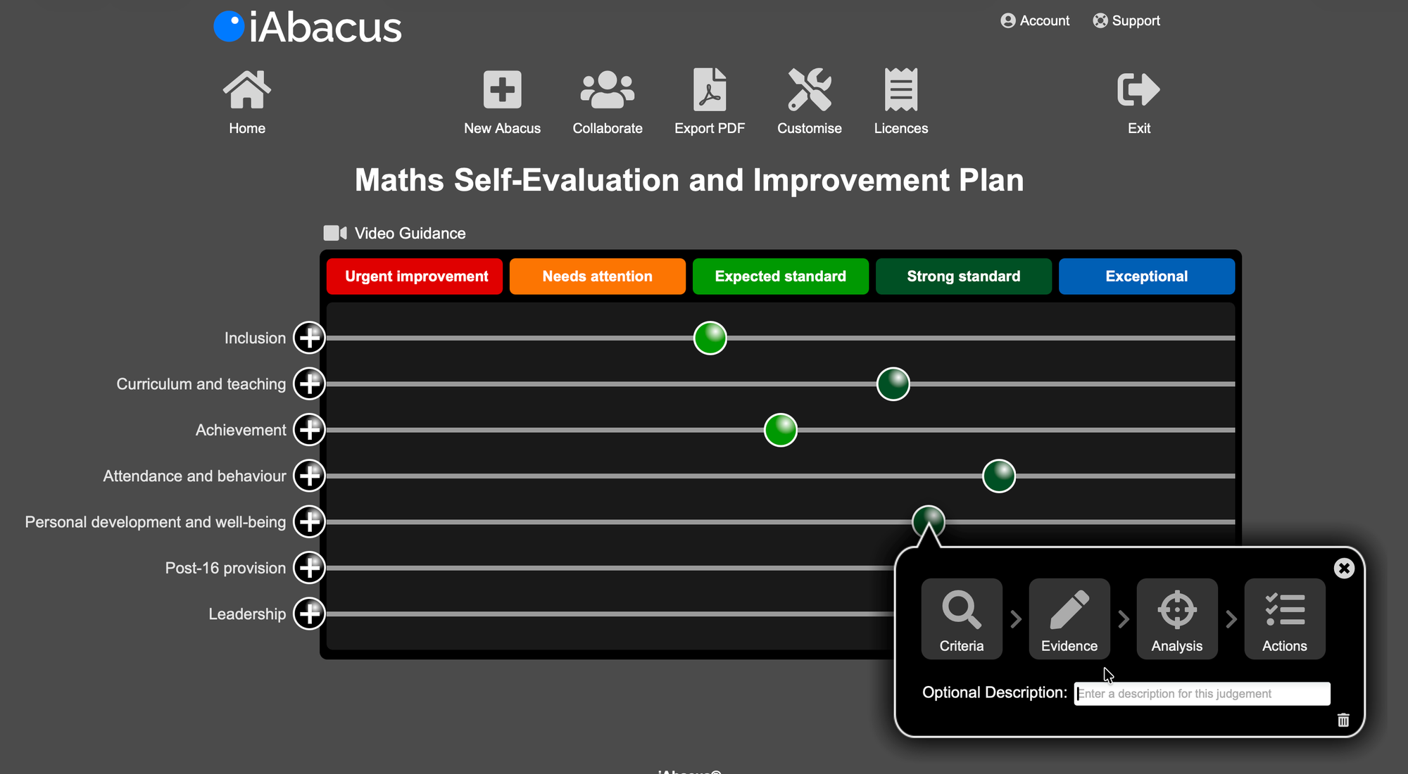
This is a Maths Self-Evaluation and Improvement Plan — one subject leader's honest assessment of how their subject is performing. The beads show where the Head of Maths has placed their judgement across the same areas. Clicking on any bead opens a menu: Criteria, Evidence, Analysis, Actions. Behind each bead is a rationale, evidence that supports it, a diagnosis of what is helping and hindering, and a concrete plan for what happens next.
This abacus was not created for the headteacher. It was created because it is genuinely useful for the Head of Maths. It gives them clarity about where their subject stands, what is driving or limiting its quality, and what they need to do about it. It is their tool, for their leadership of their subject.
But when every subject leader has done the same thing — English, Science, History, PE, all of them — those individual abacuses can be combined in seconds into the whole-school dashboard shown in the first screenshot.
The dashboard builds itself from work that was already happening. No extra reports. No additional submissions. No data chasing.
Two wins, one process
This is what iAbacus calls the win-win — and it is the principle at the heart of how dashboards work.
The first win belongs to the subject leader. They complete their abacus because it empowers them. It gives them a structured, evidence-based framework for understanding and improving the quality of their subject. That is valuable in its own right, regardless of whether anyone else ever looks at it.
The second win belongs to the headteacher. Because every subject leader is using the same consistent process and framework, their individual evaluations can be combined into a panoramic whole-school view — instantly, and without anyone doing anything extra.
The insight at the top has integrity because the empowerment at the bottom came first. Subject leaders are not filling in a form for someone else. They are evaluating their subject honestly, for themselves. That is what makes the dashboard genuine rather than performative. It reflects what people actually think — not what they chose to write for an audience.
What the dashboard enables
A headteacher with access to a whole-school dashboard like this can do things that simply are not possible when insight is scattered across conversations and documents.
They can see where evaluations are consistently strong — and celebrate and replicate that practice. They can see where there is a spread of opinion across similar subjects — and facilitate a productive conversation about why. They can identify where a subject leader has placed themselves in Needs Attention and immediately access the analysis and action plan behind that judgement, ready for a focused and informed line management meeting.
They can ask better questions. They can direct support more precisely. They can walk into a governor meeting, a trust review, or an inspection with a clear, evidence-backed picture of their school — not because someone prepared a summary, but because the honest evaluation of every subject leader is visible in one place.
And crucially — the dashboard is not a snapshot. It is live. As subject leaders update their abacuses, make progress on their action plans, and add new beads to reflect improvement, the dashboard reflects it. The whole-school picture evolves in real time.
The dashboard your school is already building
Your subject leaders are already doing the evaluation. The insight is already there, in their heads and in their notes and in their understanding of their subjects. The question is simply whether that insight is being captured in a consistent, combinable way — or whether it is remaining scattered and invisible to the people who could use it most.
iAbacus makes the answer to that question simple. When subject leaders evaluate their subjects using a shared framework, the headteacher gets a whole-school dashboard as the natural result. Nothing extra is required. The work that subject leaders were always doing becomes visible, coherent, and actionable at every level of the school.
Your dashboard is already being built. iAbacus just makes sure you can see it.
Want to see how it works in your school? Book a free demo or explore the subject self-evaluation templates to find out more.
Related reading:


